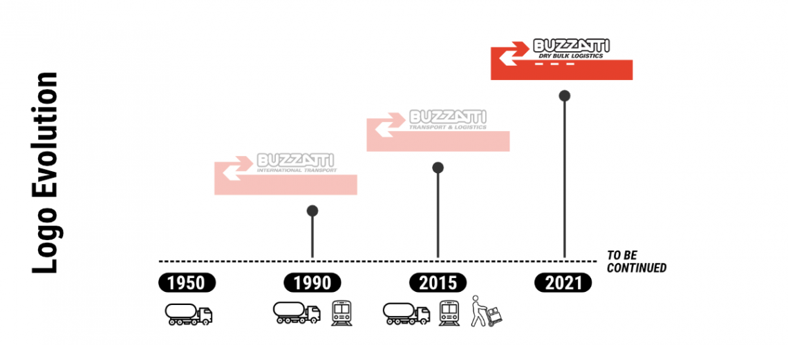
The evolution of Buzzatti’s logo tells the vision of the company.
Buzzatti is a family business, founded on the values of tradition, where history and passion have been handed down from father to son for seventy years. The heritage we have developed in the transport sector does not, however, prevent us from having a vision constantly projected into the future. This is why our image is characterized by two interlocking arrows that symbolize both goods exchange and our dynamism.
The logo and its evolution.
The current graphics are an evolution and rationalization of the first historical company logo that has not undergone major changes over time so as to give authority and recognition to the brand. On the contrary, the claims have evolved over the years, initially to emphasize our vocation to domestic and then international transports. Since 2015 customers could find the wording “Transport & Logistics” underneath the logo, but now Buzzatti wants to focus more on its excellence service: Dry Bulk Logistic.
The three colors that distinguish us are white, red and black while the official font is Aileron – sober and reliable just like the guarantees we offer our customers.
The real novelty are the three lines that indicate our main services: Road, Intermodal and Logistics, and at the same time they also symbolize the middle lines of the road, the place of our vocation, where our business has grown and where we have formed.


